Wayfloundering
I recently attended a meeting at an enormous convention resort hotel near the Dallas/Ft. Worth Airport. Such facilities have become in vogue in many cities as folks are able park themselves at these resorts for business meetings and enjoy a large array of dining and entertainment options without having to leave the site. These convention resort hotels handle everything from small business get-togethers to huge conferences. The resorts are great for families offering a variety of restaurants, pools, spas and activities so family members not attending business functions have plenty to do. Despite this particular hotel’s attractiveness, reaching this resort by car and navigating my way through the facility was anything but pleasant.
Signage Friend vs. Foe
I have lived in the Dallas Area for nearly twenty-seven years and yet finding the hotel was not easy. Road construction was underway on a number of highways and secondary streets approaching this enormous resort so even the printed Google Map with detailed directions only got me in the general vicinity of the huge complex. The resort was comprised of various buildings including the main hotel and a separate convention center. There were multiple entrances to the resort. I was headed to valet parking by the hotel lobby entrance.
There were some signs on the roads approaching the resort and as I approached the property itself I was bombarded with an overabundance of signs that slapped me across the face all at once. I was so confused that I entered the service entrance for the convention center by mistake and had to make a u-turn and ask an off-duty employee how to get to the hotel lobby. Fortunately, I valet parked the car which was easy once I got to the hotel lobby. I am looking at a hotel map as I write this and I cannot find any parking lots referenced though it’s key features 30 different symbols. The map requires strong reading glasses to attempt to decode. The map has many location names in tiny print. It is so confusing that even trying to read the map while not under pressure to get to a location in the hotel is nerve-racking.
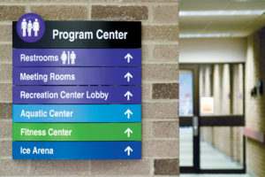
With over 1,500 guest rooms and five restaurants the hotel sprawled over many acres with a glass roof covering the hotel buildings and surrounding complex made up of lush landscaping, water features, curving paths as well as restaurants, bars and shops and other amenities scattered throughout. Signage on property was both attractive and abundant but I found that the signage confused more than assisted. I became more stressed as I tried to find my destination on the map and then follow the signs through acres of sprawl to get to where I needed to go. I longed for a GPS device to get me from where I felt stranded to my destination. I asked several employees for directions interrupting their assigned tasks and impacting their productivity. When I departed the hotel it was dark. I followed property signs but because of poor signage and construction I ended up on the wrong highway.
Signage Should Not Be an Afterthought
It was obvious that this huge resort spared no expense in its design, construction and amenities. The facilities were four-star all the way with top-notch service, great meeting rooms and outstanding food. Architectural signage was plentiful and attractive but less than useful. It was obvious, that the signage was an afterthought that was slapped together as the project was in its final stages. Unfortunately, the signage added to confusion rather than providing badly needed wayfinding assistance.
For signage to work its magic enabling guests, vendors and employees to navigate their ways effortlessly with a minimum of stress, signage needs should be considered early in the design phase and not left to complete at the last minute when punch-list items are being addressed.
Would I recommend holding a meeting at this acclaimed convention resort hotel? The facilities, amenities and service would encourage a definite yes. However, the confusion caused by trying to navigate to and through the resort would discourage a positive recommendation.
Consulting your architectural signage consultant at ASI early in your project’s design will maximize impact and minimize wayfloundering!
John Selig
Marketing Manager


