Planning Sign Locations & Content
When beginning a signage program, it is important to first determine which destinations are most important and the hierarchy of those destinations. The client’s input is essential for providing information as to which destinations are most likely to be visited within the site. Second, after having determined the destination and the hierarchy of the destinations, the message that the sign carries must be determined, after all a sign is merely a mechanism for carrying a message.
The hierarchy of destinations referenced above implies that by focusing on the most important destinations for wayfinding, the planner enhances the effectiveness of directional signs by reducing information overload and conserving space on sign faces. For example, if one is visiting a hospital building that has three wings, the directory in the lobby would identify which destination is in each wing. From that point the initial directional sign should merely guide the visitor to Wing A, B or C. Once the visitor arrives at his wing the information on the sign may get more specific say, identifying Radiology in that wing. The next sign may then identify MRI, or XRay or CTScan.
Implementing proximity-based messaging also aids in the effectiveness of a wayfinding strategy. Space on the sign face is conserved by adding and removing destinations from directional signs based on proximity.
Mapping out sign locations and establishing the messages that will be displayed on each sign, known as the message schedule, is a process that requires extensive coordination and review. An accurate and thoughtful Message Schedule and Location Plan are central to an effective signage program.
Assessing Site Conditions

The process of determining sign locations is slightly different depending on if the project is for a new or existing site. If the project is for an existing site, ASI can survey the location to analyze the site conditions and needs. ASI consultants will then methodically begin the process of developing a wayfinding program with a thorough assessment of the traffic flow within the facility or campus.
In addition to circulation patterns, ASI assesses site conditions such as:
- Viewing distances, angles and sight-line obstructions
- Physical limitations of sign sizes and mounting heights
- Lighting conditions and electrical access
- Existing wall conditions and sign mounting options
- Material, color and finish of adjacent surfaces
For a site that is under construction or being planned, the process of developing sign locations relies heavily upon site drawings, such as floorplans and site plans. In addition to site drawings, all available engineering and architectural drawings are assessed carefully such as: elevations showing vertical surfaces, sections showing vertical slices through the site and, when overhead signage is specified, reflected ceiling plans.
Regardless of if the project is for a new or existing site, site drawings are used as the main tools for ASI consultants to analyze and map out key sign locations within a signage program.
Sign Location Plan

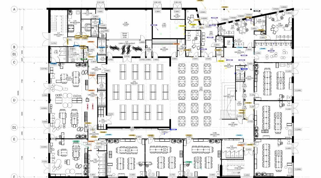
After studying the site and its key decision points, ASI will plan the sign locations using site drawings by making a mark to indicate each sign on the plan. ASI color-codes different sign types to aid in review – for example, a red dot to signify Room ID signs and blue dots for Directional Signs, etc.
Below are a few factors that go into optimal sign placement:
- Directional signs should be placed at key decision points within a site
- Place additional Directional signs along lengthy hallways for assurance
- Whenever possible, place Directional signs in front of the viewer’s line of sight
- Identification signs should be placed at the destinations listed on Directional signs
- Never over-sign a facility
To further aid in reviewing the sign locations, ASI utilizes digital mapping software to provide floorplan visuals of the project site. The effect is almost as if you’re walking down the hallway to assess the signage firsthand. Since most sign planning is done with lateral analysis on floor plans, ASI takes extra time to review vertical wayfinding for multistory facilities.
Developing sign location plans is a process – it’s expected that there will be several iterations of the sign location plans before they are finalized.
Message Schedule

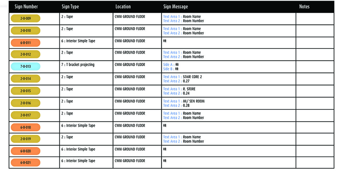
Alongside the sign location plans, ASI outlines what the sign will read at each planned location. This information, known as the message schedule, is collected and communicated in spreadsheet format.
Message Schedules should contain:
- Sign Number: Unique number for each sign. Refers to the sign location plan and the specific location of each sign within the site.
- Sign Type: Refers to the approved design and specification for a sign. For example, Room Identification signs will have a different Sign Type than Directional signs.
- Sign Message: Displays the text and graphic content for the sign.
- Notes: Shows any questions or special instructions for the sign.
- Message schedules for large projects typically also incorporate spreadsheet columns for building names and floor numbers.
Each project site requires a message schedule that is consistent and concise. Destination names must be reviewed and edited for conciseness and clarity; Once a destination name has been determined, it should be used on every sign relating to it. Technical messages should be consistent and technically correct. For example, if one message for a destination is Maternity, determine the terminology that the hospital requires and be consistent – it could be Labor Section, Obstetrics, and so forth. Be clear and consistent.
Reviewing Documentation

The quality of a message schedule has a direct effect on the quality of the signage that will be installed – a thorough review of the message schedule saves time and money down the road.
Below are some tips for Message Schedule creation and review:
- Create the Message Schedule in a format that is easy to read and review, such as a spreadsheet.
- Capitalize & format text the way it will appear on the sign.
- Room numbers assigned during the architectural design process may need to be reworked for a new, more logical room numbering system.
- Only use commonly recognized abbreviations. If you use an abbreviation for a destination, use it consistently.
- Levels 1 – 3 or Levels 1 to 3: Choose one and be consistent.
- Be consistent in the presentation of non-text. If you represent a graphic symbol with brackets around a description [No Parking Symbol], follow that format consistently.
- If your signage has translations, the same translation should be used across the program. Always have a native speaker review the message schedule with translations for inconsistencies or errors.
Information, graphics and hardware of a signage program are affected by federal, state and municipal codes and regulations. Signage must be designed with government regulations in mind. ASI develops compliance strategies with the input of code consultants, regulatory officials and professional outside organizations. Speak to an ASI Consultant today to begin your new project.

