Best of ASI 2021 Winners
ASI Signage is one of the largest architectural signage organizations in the US, with 500+ employees based out of 30 offices across the country. We have a wide-reaching audience and client base that is familiar with ASI due to our industry experience and strong reputation.
The annual Best of ASI competition focuses on promoting and celebrating the year’s best signage design and creative projects from the ASI network. Its mission is to inspire fellow industry professionals and to showcase meaningful signage installations that bring spaces to life.
For the 2021 competition, Best of ASI received over 20 project nominations. Entries are ranked by both ASI employees and distinguished industry judges. The top award is the Bloom Award, with the largest percentage of votes overall.
Winners are recognized as ASI’s most creative and inspired signage professionals. Judging for the Best of ASI Competition takes place in the First Quarter of the year. Following the selection of the winners, typically ASI will honor the Best of ASI recipients at our annual Sales Meeting and Awards Show at the ISA Conference and Expo.
In addition to inclusion on the Best of ASI Winners Announcement, all Winners received a Best of ASI showpiece trophy in which their project is engraved into a crystal block and illuminated from below with LED lighting.
Bloom Award: Congdon Yards
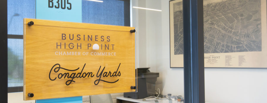
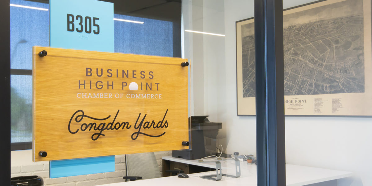
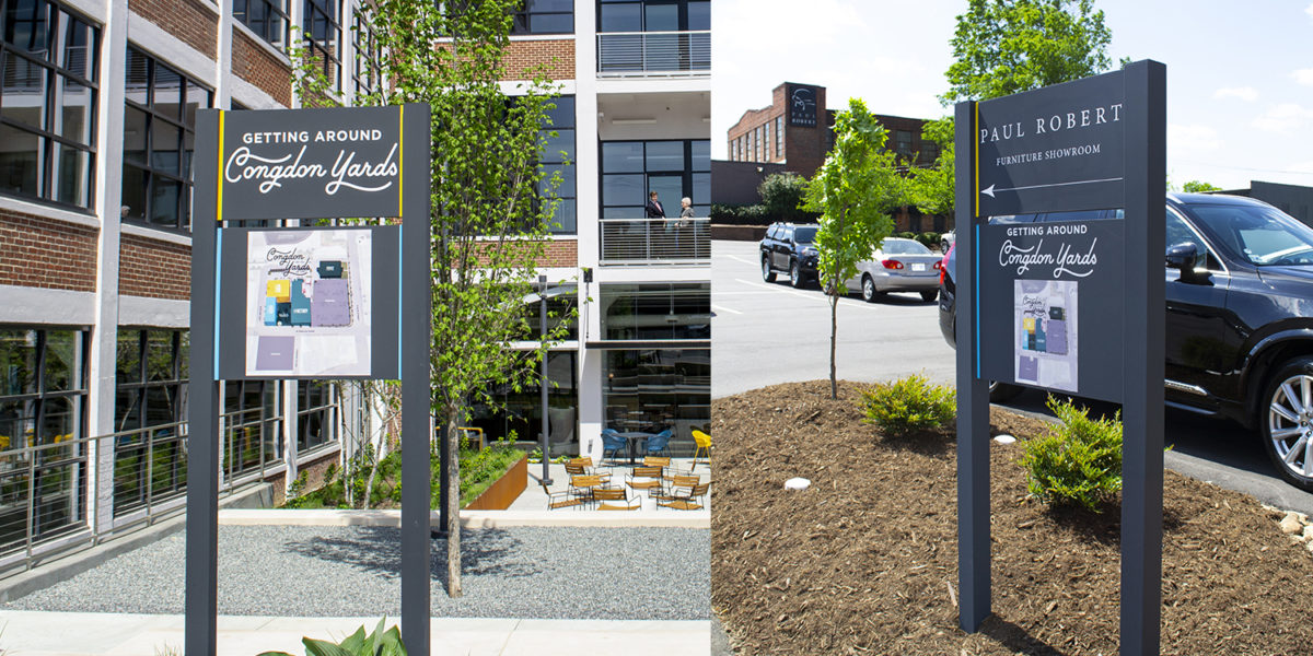
The story of Congdon Yards began with a local initiative to revitalize downtown High Point, North Carolina. ASI worked in a collaborative partnership with Barbour Spangle, Think Creative, and Louis Cherry Architects to create custom signage for the Plant 7 portion of the property. ASI was a major contributor to the design and development of this cohesive team’s concepts into a diverse signage package. ASI incorporated wayfinding, including a campus map, both on the interior and exterior of the facility. ASI’s signage package also included: branding signage, environmental graphics, and a history wall honoring both the legacy of the project and the generosity of its donors. Signage completed the transformation of Congdon Yards into a dynamic new gathering space in downtown High Point.
Best Design-Build Solution: The Fitz on Fairfax
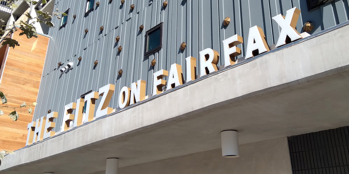
The Fitz on Fairfax is a project of KPRS Construction, a general contractor, and Palisades, a real estate development company. ASI provided expert consultation and a signage budget for a Design-Build signage package based on preliminary architectural drawings. KPRS then provided updated drawings, from which ASI developed a Design-Build signage proposal and presented it to Palisades management. ASI worked closely with the management team at Palisades in designing branded interior signage with intricate, dimensional patterns. Special details include a recessed flamingo on the Room ID signage and internally-illuminated exterior Channel Letters with bronze-painted returns. The Fitz on Fairfax now boasts a strong signage package that enhances the architectural environment and cultivates a sense of community.
Best Interior Solution: JFSA of Cleveland
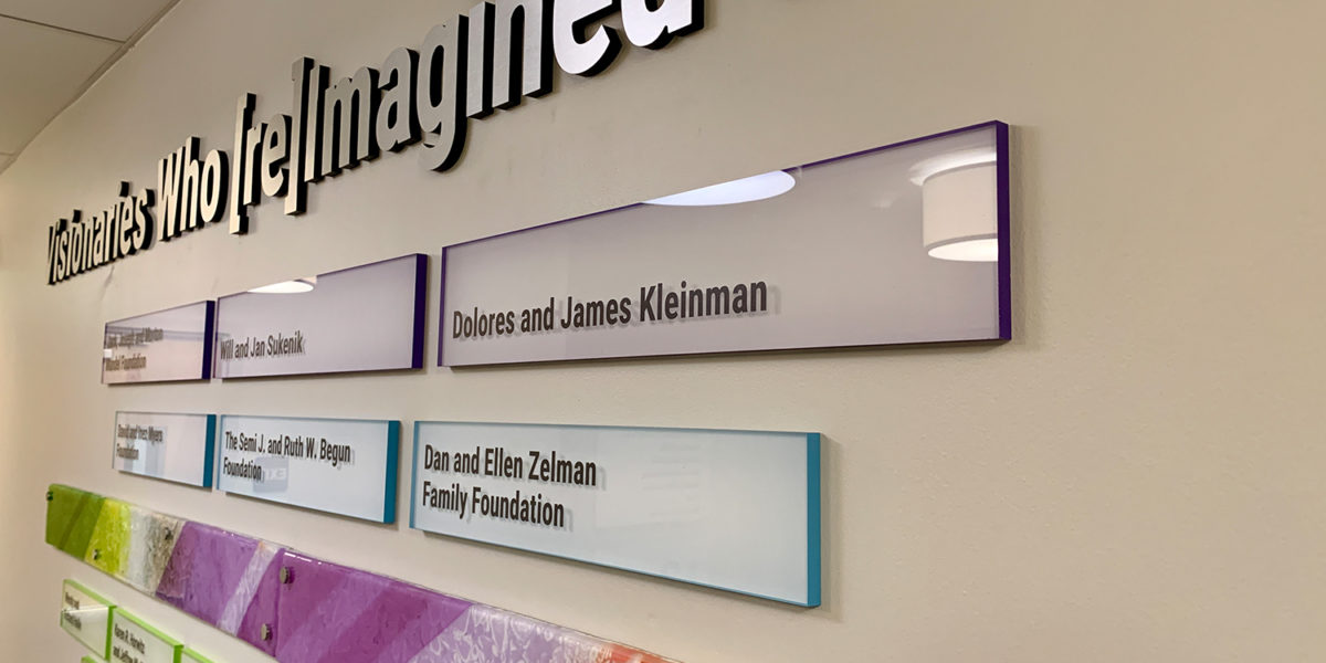
The JFSA of Cleveland is a non-profit agency that helps individuals and families with solutions to face life’s challenges with confidence. The signage package consists of a variety of interior signs made of acrylic with the returns painted in the brand’s colors. Special details include office nameplates that attach magnetically for future updates, and directional signage with routed-out graphics, revealing a second layer of acrylic painted to match the returns. The donor recognition wall proudly honors those who help sustain the mission of the JFSA of Cleveland. Different colors represent the financial contribution made and play off of the glass flames and bar provided by the client. The new signage package honors donors, brands the space and creates an energetic office environment for the organization’s important work.
Best Exterior Solution: The Inn at Meadowbrook
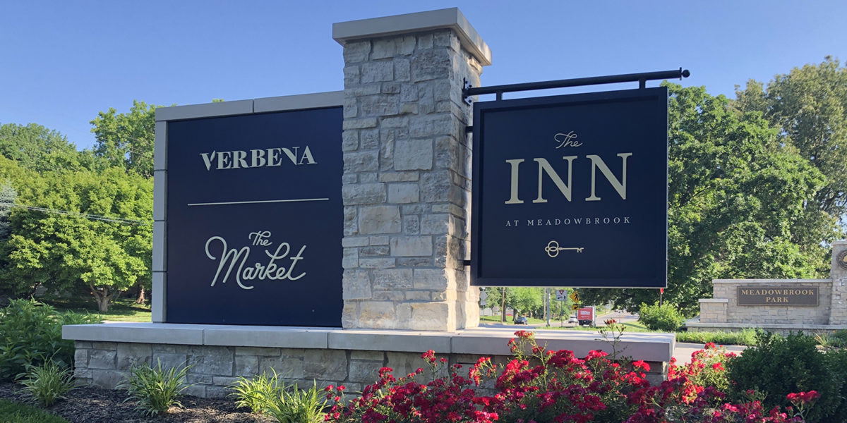
The Inn at Meadowbrook grew out of what was once the Meadowbrook Golf and Country Club, now transformed into Meadowbrook Park. ASI was brought on to collaborate on the project with Willoughby Design, the designer of the project. ASI worked closely with the designer to bring the designs to life through applicable product solutions. The project goal was to develop custom interior & exterior solutions unique to The Inn at Meadowbrook. The signage package for the project included branding and wayfinding signage. A diverse array of sign types were implemented including dimensional letters, blade signs, a custom monument sign, overhead signage, Room ID signs and a cast bronze plaque. The design of the signage package adds a level of luxury and wayfinding ease to the tranquil Inn at Meadowbrook.
Best Recognition Solution: LECOM Harborcenter
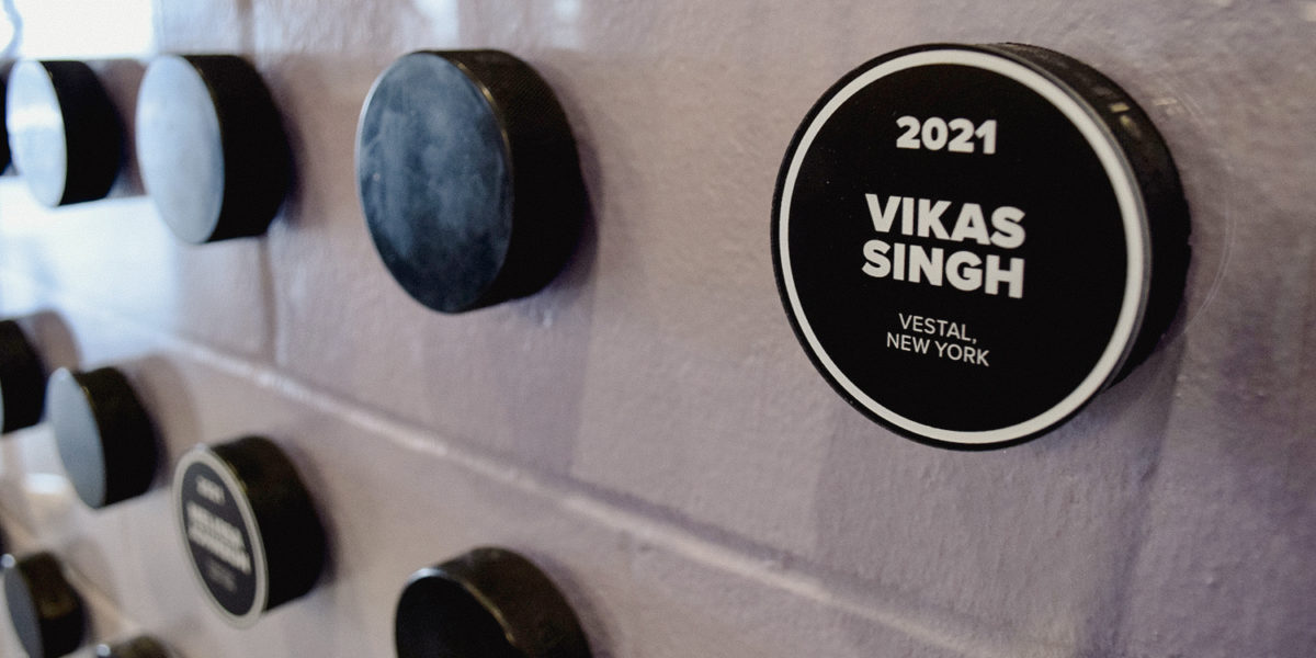
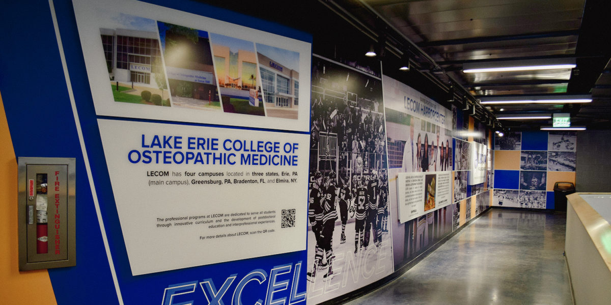
LECOM Harborcenter is a mixed-use facility in downtown Buffalo, New York developed by Pegula Sports and Entertainment (PSE). ASI is a longstanding partner of the developer, PSE. The main focus of this project was how to best represent LECOM and their partnership with PSE to the Buffalo community. ASI provided value-engineering services on the client’s initial design concept. The recognition wall honors medical student recipients of the PSE Scholarship and contains actual hockey pucks with digitally printed disks adhered to the pucks. ASI utilized a digitally printed wall wrap, then incorporated subsurface-printed acrylic panels that tell the story of LECOM Harborcenter. Two aluminum box panels with dimensional lettering proudly display the LECOM Harborcenter logo, reinforcing the brand and partnership.
Best Innovative Solution: Grace Fellowship Church
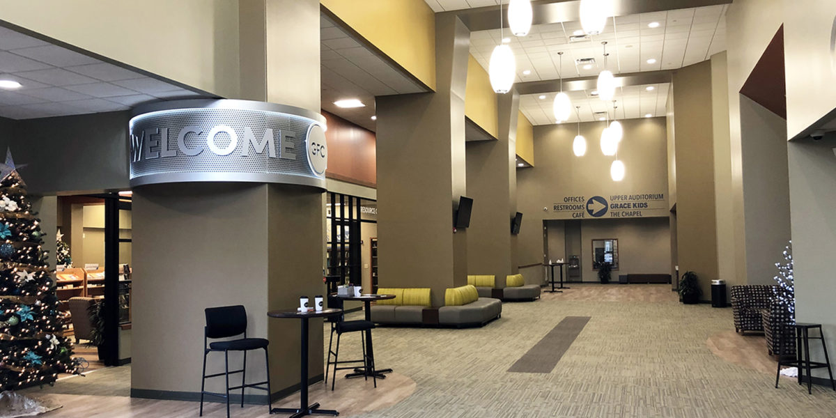
Grace Fellowship Church is a multi-site church. The unique project called for a special solution – eye-catching signage to draw attention to Grace Fellowship Church’s new Welcome Center. Grace Fellowship Church discussed their concept for a highly visible sign with ASI during the initial consultation. The idea was to implement a sign large enough to greet parishioners and guests from three sides. With this in mind, the natural solution was to implement a sign that was either circular or semi-circular. When considering illumination, ASI’s Sales Consultant recommended perimeter LED illumination. Discussing the design and layout, ASI designed the perforated background to add interest and the large dimensional lettering and central logo. Now, the innovative, custom-designed sign greets church parishioners and visitors each week.
Best Wayfinding Solution: Congdon Yards
The story of Congdon Yards began with a local initiative to revitalize downtown High Point, North Carolina. ASI worked in a collaborative partnership with Barbour Spangle, Think Creative, and Louis Cherry Architects to create custom signage for the Plant 7 portion of the property. ASI was a major contributor to the design and development of this cohesive team’s concepts into a diverse signage package. ASI incorporated wayfinding, including a campus map, both on the interior and exterior of the facility. ASI’s signage package also included: branding signage, environmental graphics, and a history wall honoring both the legacy of the project and the generosity of its donors. Signage completed the transformation of Congdon Yards into a dynamic new gathering space in downtown High Point.
Best Wall Graphics: LECOM Harborcenter
LECOM Harborcenter is a mixed-use facility in downtown Buffalo, New York developed by Pegula Sports and Entertainment (PSE). ASI is a longstanding partner of the developer, PSE. The main focus of this project was how to best represent LECOM and their partnership with PSE to the Buffalo community. ASI provided value-engineering services on the client’s initial design concept. The recognition wall honors medical student recipients of the PSE Scholarship and contains actual hockey pucks with digitally printed disks adhered to the pucks. ASI utilized a digitally printed wall wrap, then incorporated subsurface-printed acrylic panels that tell the story of LECOM Harborcenter. Two aluminum box panels with dimensional lettering proudly display the LECOM Harborcenter logo, reinforcing the brand and partnership.

