Project: Kettering Health Network
Location: Various Locations, OH
Markets Served: Healthcare
Effective Wayfinding for Healthcare Facility
Kettering Health Network, a major healthcare provider in the Midwest with eight hospitals and dozens of affiliated service locations, implemented an initiative to streamline the interior signage across their network.
The client’s network includes hospitals, physician network facilities and outpatient locations. The various facilities had differing budgetary constraints. The differences in the type of facility and budgetary consideration had to be considered in developing a signage program. A consistent look across the network was also a priority for the client.
About the Solution
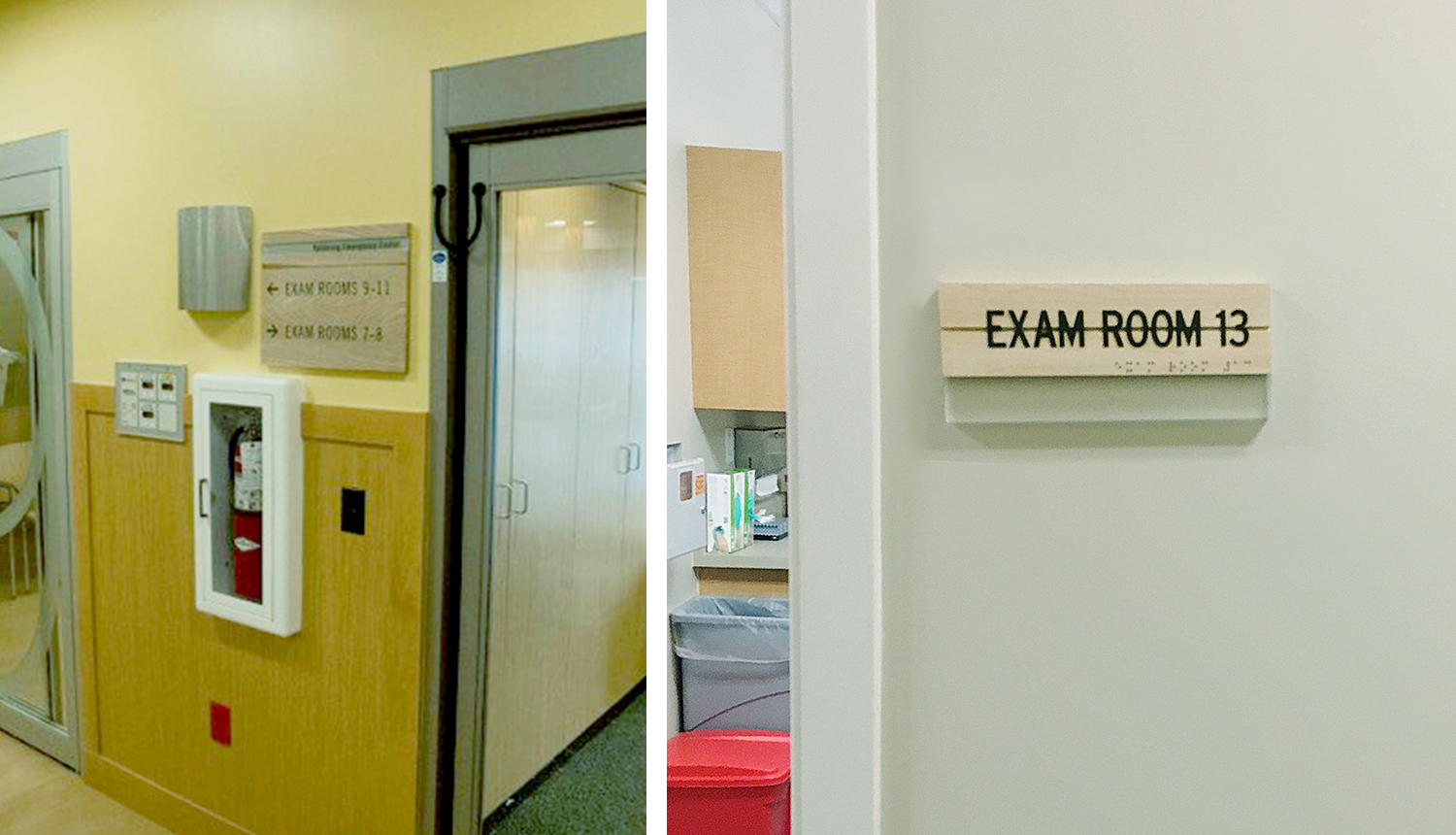
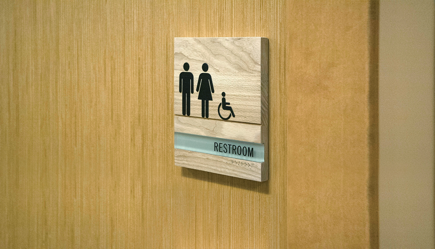
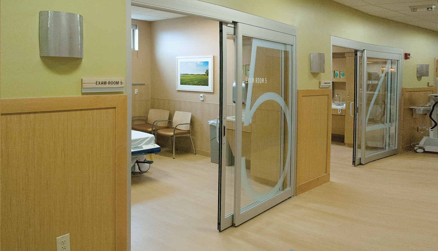
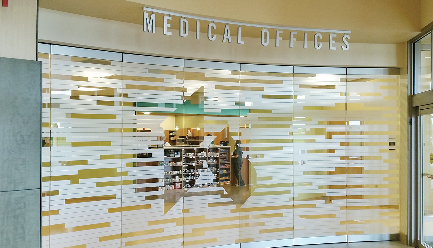
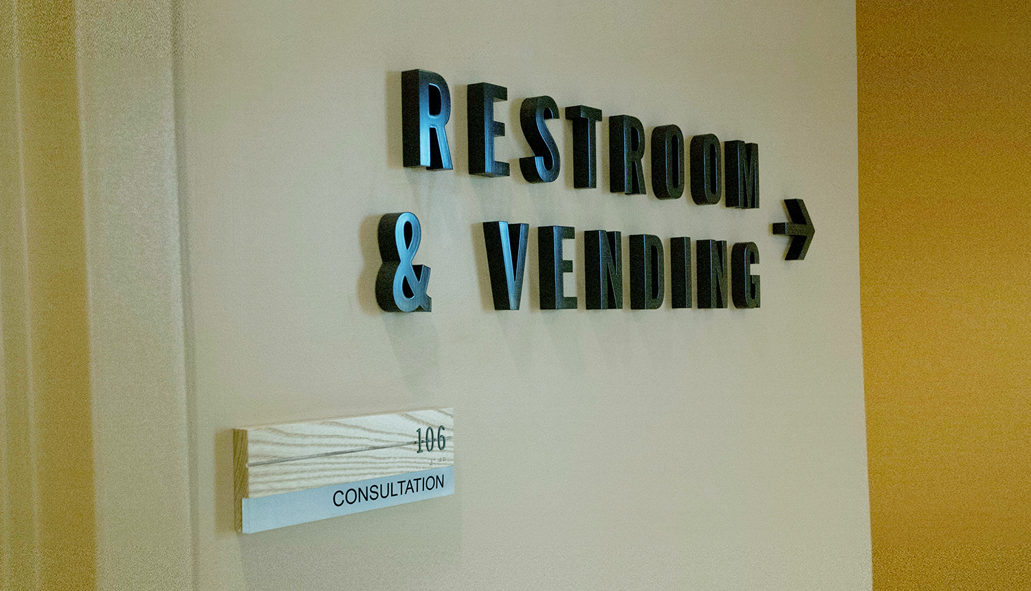
Kettering and its signage partners standardized the signage and documented the sign types and sign design of their standard sign solution in a Brand Manual. The signage was divided into four groups – Tier 1, Tier 2, Tier 3 and Specialty signs. Which Tier a facility will use is dependent on the type of the facility and the budgetary constraints of that facility. Specialty signs were to be used in any facility if the need for that specialty sign arose. Tier 1 uses the highest quality materials that offer the greatest durability. These custom signs feature solid wood with three color stain options. Tier 2 uses simulated wood finishes applied to acrylic substrate and painted edges to mimic Tier 1 but at a lower price point. Tier 3 uses a clean, polished curved-face extrusion system design based on a single piece of extruded aluminum, which creates stability and consistency across the line, and allows for a variety of panel inserts.
CS1267

