Project: Michelman Corporate Headquarters
Location: Blue Ash, OH
Markets Served: Corporate
Showcasing a Corporate Brand
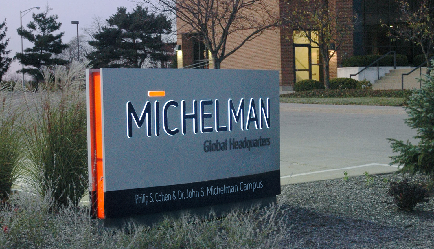
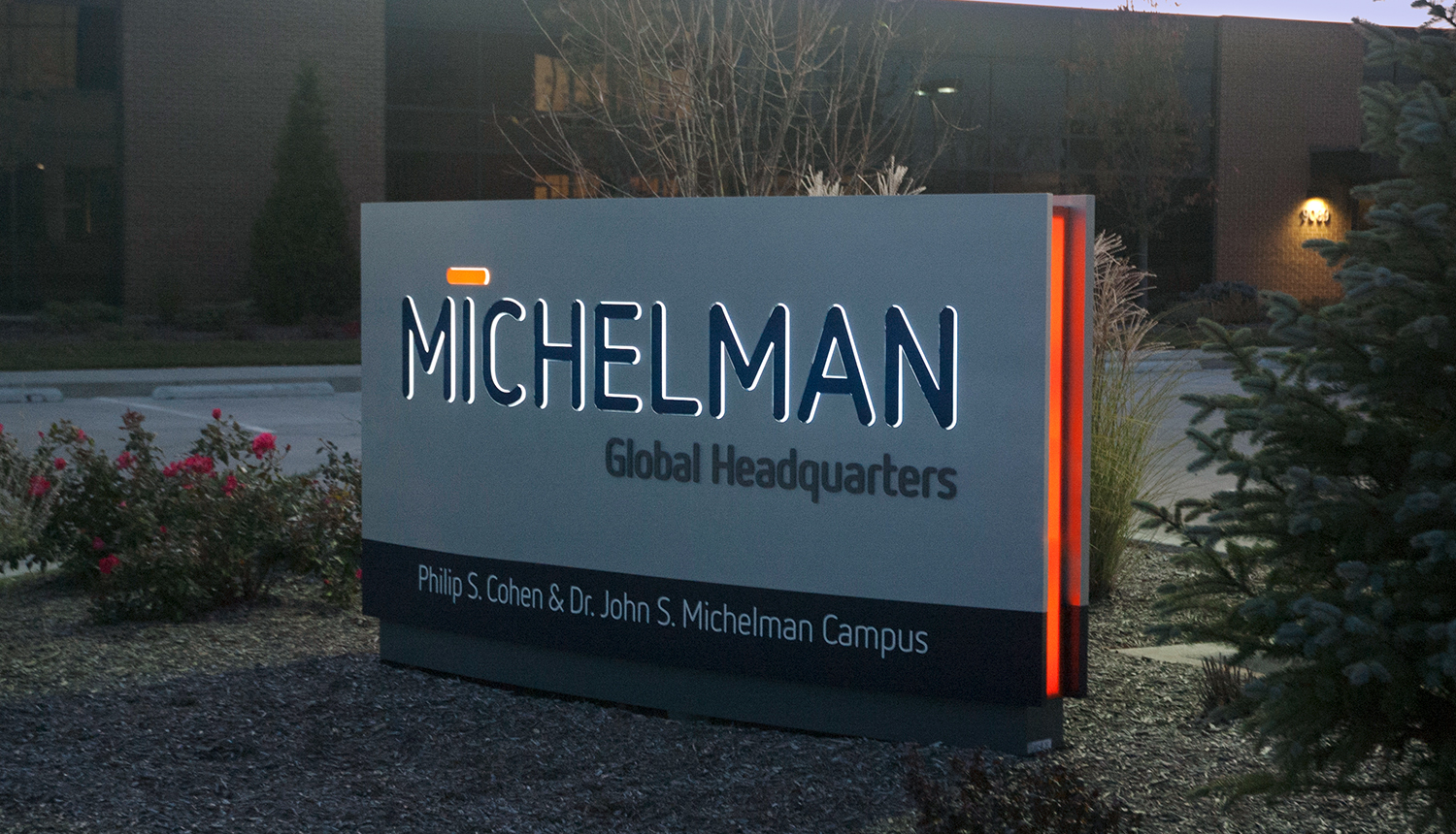
Michelman is a developer and producer of environmentally friendly materials for industry, including wood and floor care products, metal and industrial coatings, paints, varnishes, inks, fibers and composites. With offices in seven different countries, Michelman is globally headquartered in Blue Ash, Ohio, a suburb of Cincinnati, and employs 150 people locally. Michelman had previously done business with ASI to update campus wayfinding signage and interior office IDs. However, given its location on a high-traffic, business corridor, the company required exterior signage to identify it’s presence and showcase its brand. ASI assisted once again to design, produce, and install highly visible, Michelman branded, halo-illuminated letters.
About the Solution
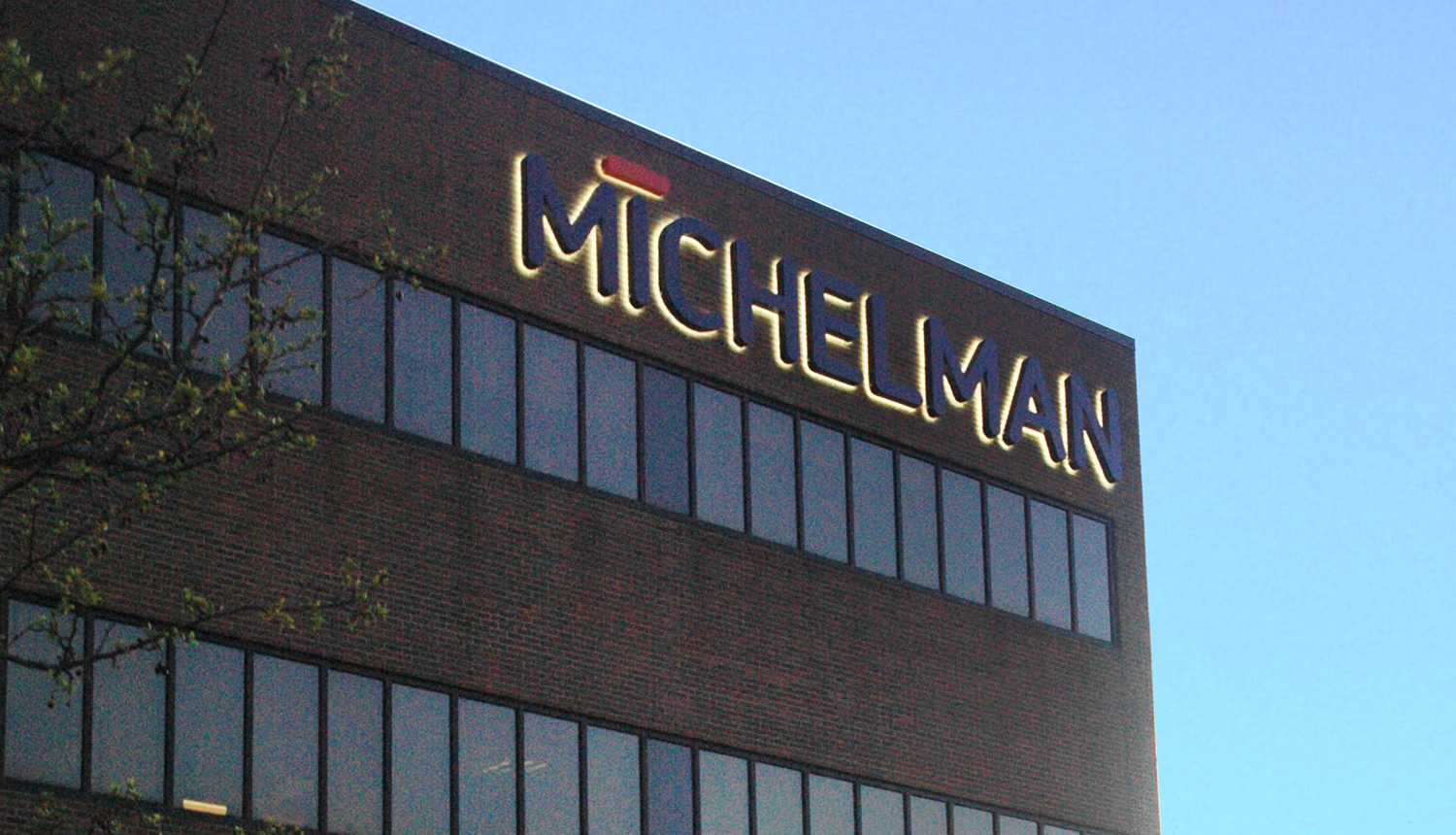
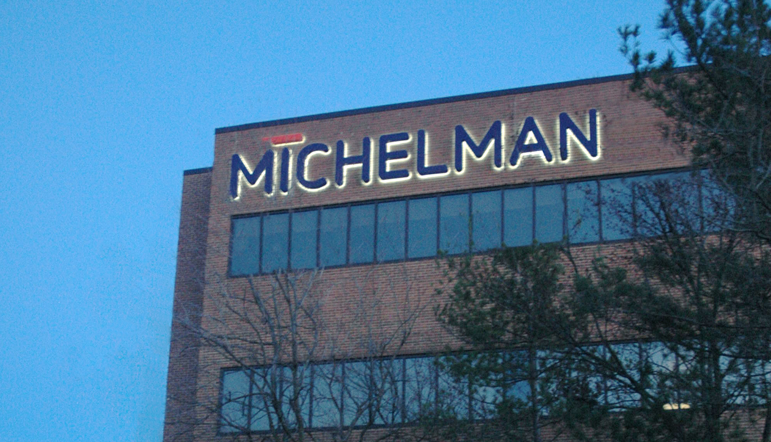
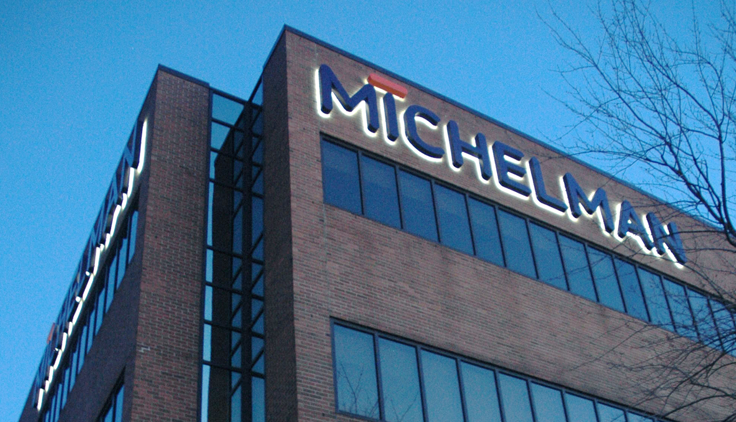
Michelman’s current logo has two colors, dark blue for the letters and a dark orange accent atop the “I”. The company needed the sign to be illuminated, but in a way that did not lighten or significantly alter the colors of the logo brand. Since the logo would be mounted to the light-colored brick wall at the pinnacle of the building, the decision was made to design halo-illuminated, aluminum Channel Letters. This kept their dark blue and orange colors consistent with their brand and provided the most contrast during the day against the light brick. The LED white halo illumination for the night view provides an architectural, modern representation of their logo. Since the building sits with the corner pointed towards the Ronald Reagan Cross County Highway, no single location could capture travelers moving in both East and West directions. City ordinances allowed for only one exterior sign, but ASI worked closely with Michelman and the City of Blue Ash to have a variance approved, allowing for logo signs to be installed on two corners of the building.
ASI conducted a wayfinding analysis of the office building and its surroundings to determine the optimal size for the logo. Using the moving text calculations, ASI determined that the height of the letters should be 48”. On and off-site photos were taken, and renderings of the signs were imposed on top of the photos.
The design ultimately enhanced Michelman’s brand by making its logo visible during the day and night along the busy commercial corridor.
CS1285

