Pantone’s Color Matching System
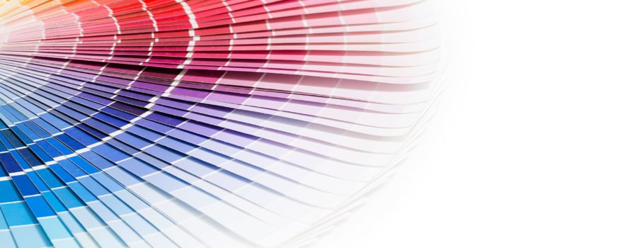
Pantone is the most important color matching system in the world. In 1963, Pantone introduced the first color matching system to solve the problem of complicated color matching in the printing industry. Pantone is the easiest and simplest way to reference and match colors with the use of a fan deck color guide. Pantone fan decks allocate each color with a specific code and include the color’s Light Reflectance Value, a vital visibility factor to consider in signage design.
The Pantone Matching System (PMS) is a system to maintain consistency of color on printed materials. Color matching is essential to upholding brand identity across all platforms – from brochures to promotional items to signage. For online marketing, Pantone converts a color into the corresponding RGB and HEX codes that are more commonly used in digital platforms.
Utilizing the Pantone Matching System keeps all parties involved in a signage program – the designer, client and production team – on the same page. Once a design enters the production stage, confirming a color sample against a Pantone fan deck is a vital step in quality control. Pantone recommends replacing fan deck color guides every 12-18 months, especially if using it to quality control or approve a sample, as the colors fade and change over time and with wear.
Keep in mind that Pantone is a system for print – think ink and paper. Pantone provides the dictionary to a language consisting purely of colors for print. When translating colors specified from the Pantone system into signage, there is a distinct process required in order to match it with a corresponding color of paint, vinyl or other material.
Still curious about how paint can simulate a Pantone color? We’ll dive into the topic of converting Pantone to paint in an upcoming ASI article that takes a close look at how top paint companies established color-matching processes that structurally complement and expand upon the Pantone system in paint applications.
Pantone’s Colors of the Year for 2021
Ultimate Gray, Pantone 17-5104, and Illuminating, Pantone 13-0647, have both been awarded the 2021 Color of the Year. Together, these colors embody a message of hopefulness that is both enduring and uplifting. Amidst the continuing uncertainty, the colors express a message of strength and positivity.
Each year, Pantone’s Color of the Year influences product development and purchasing decisions across an array of industries. Pantone’s experts are unmatched in their knowledge of how color and design impact consumer behavior. When new colors of the year are announced, such as Ultimate Gray and Illuminating, Pantone offers inspirational social media filters, products and color palettes that highlight the color.
Created in 2000, the Pantone Color of the Year has become increasingly influential in design and marketing. The Pantone Color Institute undergoes extensive research, analyzing color trends throughout the year to arrive at their Color of the Year selection each December.


