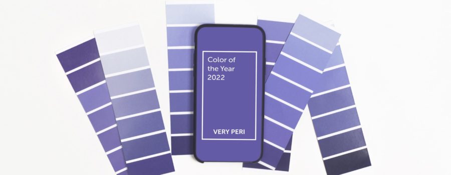
Pantone’s 2022 Color of the Year
Very Peri, PANTONE 17-3938, has been awarded the 2022 Color of the Year. For the first time in the history of Pantone Color of the Year, the Pantone Color Institue created a new color specifically to represent the unique innovation and transformation of 2022. Very Peri was created to embody the possibilities that lay before us; Amidst the continuing uncertainty, Very Peri expresses a message of inventiveness and creativity.
“The Pantone Color of the Year reflects what is taking place in our global culture, expressing what people are looking for that color can hope to answer.”
Leatrice “Lee” Eiseman, Executive Director of the Pantone Color Institute
Each year, Pantone’s Color of the Year influences product development and purchasing decisions across an array of industries. Pantone’s experts are unmatched in their knowledge of how color and design impact consumer behavior. When new colors of the year are announced, such as Very Peri, Pantone offers inspirational social media filters, products and color palettes that highlight the color.
Created in 2000, the Pantone Color of the Year has become increasingly influential in design and marketing. The Pantone Color Institute undergoes extensive research, analyzing color trends throughout the year to arrive at their Color of the Year selection each December.
About Pantone

Pantone is the most important color matching system in the world. In 1963, Pantone introduced the first color matching system to solve the problem of complicated color matching in the printing industry. Pantone is the easiest and simplest way to reference and match colors with the use of a fan deck color guide.
Pantone fan decks allocate each color with a specific code and include the color’s Light Reflectance Value, a vital visibility factor to consider in signage design. The Americans with Disabilities Act Accessibility Guidelines (ADAAG) recommend a contrast in Light Reflectance Values between sign text and background colors of 70% or above. ASI offers a free LRV Contrast Calculator to simplify the process of ensuring your signage color choices meet or come close to the 70% contrast mark.
The Pantone Matching System (PMS) is a system to maintain the consistency of color on printed materials. Color matching is essential to upholding brand identity across all platforms – from brochures to promotional items to signage. For online marketing, Pantone converts specific colors into their corresponding RGB and HEX codes that are more commonly used in digital platforms.
Utilizing the Pantone Matching System keeps all parties involved in a signage program – the designer, client and production team – on the same page. Once a design enters the production stage, confirming a color sample against a Pantone fan deck is a vital step in quality control. Pantone recommends replacing fan deck color guides every 12-18 months, especially if using it to quality control or approve a sample, as the colors fade and change over time and with wear.
Print vs Paint

Keep in mind that Pantone is a system for print – think ink and paper. Pantone provides the dictionary to a language consisting purely of colors for print. When translating colors specified from the Pantone system into signage, there is a distinct process required in order to match it with a corresponding color of paint, vinyl or other material.
For example, the primary ASI colors are ASI Blue, Pantone 2925, and ASI Golden Yellow, Pantone 7409. For each color, ASI has corresponding RGB and HEX codes for digital applications as well as formulas for paint. Paint can vary in hue or vibrance depending upon factors such as the number of coats applied, the surface it is applied to, and whether or not a primer coat is applied.
Like Pantone’s Color of the Year, ASI’s colors have symbolic qualities. ASI Blue, Pantone 2925, conveys trust, integrity, dependability and strength. ASI Golden Yellow, Pantone 7409, conveys optimism, clarity, warmth and a sense of pride.
Over our 55+ years of experience, ASI’s Sales Consultants and Graphic Designers have worked alongside clients to cultivate their brand presence by leveraging our color knowledge – turning Pantone color palettes into physical signage within a space. Request a Consultation today to discuss how ASI can assist your organization to achieve its signage goals in 2022 and beyond.
Sources:
Pantone Color of the year 2022. Pantone. (2022). Retrieved January 26, 2022, from https://www.pantone.com/color-of-the-year-2022


