Viva Magenta – Pantone Color of the Year
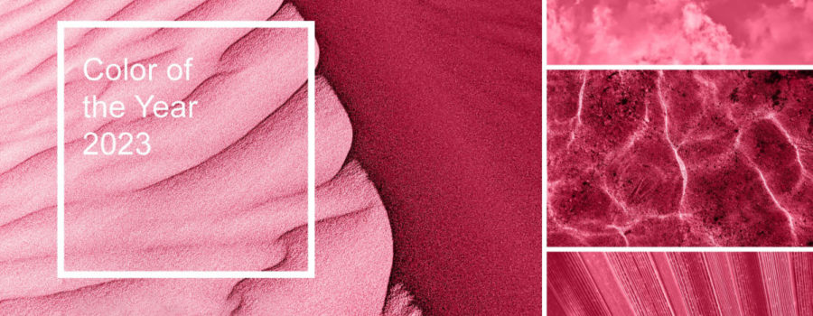
Pantone’s Color of the Year, Viva Magenta 18-1750, is an exuberant, vibrant color that traces its origins to the natural dye carmine. Viva Magenta promotes joy, fearlessness, self-expression, and exploration.
“In this age of technology, we look to draw inspiration from nature and what is real. Pantone 18-1750 Viva Magenta descends from the red family and is inspired by the red of cochineal, one of the most precious dyes belonging to the natural dye family as well as one of the strongest and brightest the world has known… Viva Magenta galvanizes our spirit, helping us to build our inner strength.”
Leatrice “Lee” Eiseman, Executive Director of the Pantone Color Institute
In a New York Times article, Regina Blaszczyk, author of The Color Revolution and University of Leeds business history professor expressed that Pantone effectively creates a recognized celebrity each year with its Color of the Year. Indeed, you may have already noted Viva Magenta in your day-to-day life – from physical products to digital designs.
Perhaps the best way to interact with Viva Magenta is through the immersive gallery experience Magentaverse, presented by Artechouse, a 22-minute cinematic and audiovisual exploration of Viva Magenta. “Pantone’s Color of the Year is a harbinger for trends across the global art, fashion, and design communities,” said Sandro Kereselidze, Artechouse’s Co-founder & Chief Creative Officer.
The Power of Color

Color has power in consumer behavior. Research conducted by the Seoul International Color Expo documented 92.6% of respondents report placing the most importance on visual factors such as color when purchasing products. Our interpretation of color is almost instantaneous – a study conducted by the Institute for Color Research suggests that, within 90 seconds of viewing a product or an environment, people make subconscious assessments based on color. When it comes to brands, the University of Loyola, Maryland conducted a study of color that suggests brand colors increase brand recognition by up to 80%.
“It is a visual language we all understand, one whose message crosses genders, generations, and geographies… Learning more about the unique meanings particular colors give voice to helps us to be a more expressive, closely connected society, one that provides people with a more holistic understanding of their peers and communities alike.”
Laurie Pressman, Vice-President of the Pantone Color Institute
Each year, Pantone’s Color of the Year influences product development and purchasing decisions across an array of industries. Pantone’s experts are unmatched in their knowledge of how color and design impact consumer behavior. When new colors of the year are announced, such as Viva Magenta, Pantone offers inspirational social media filters, products, and color palettes that highlight the color.
Initiated in 2000 with the announcement of Cerulean Blue, the Pantone Color of the Year highlights the connection between color and culture. Winning colors, such as Viva Magenta, have become increasingly influential in design and marketing ever since. The Pantone Color Institute undergoes extensive research, analyzing color trends throughout the year to arrive at its Color of the Year selection each December.
Pantone and Signage

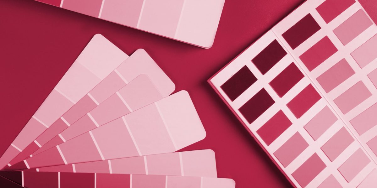
In 1963, Pantone introduced the first color-matching system to solve the problem of complicated color matching in the printing industry. The Pantone Matching System (PMS) is a system to maintain the consistency of color on printed materials – the easiest and simplest way to reference and match colors is with the use of a fan deck color guide. Color matching is essential to upholding brand identity across digital and physical applications; Utilizing the Pantone Matching System keeps all parties involved in a signage program on the same page.
As Pantone is a system for print, there is a process required to match a specified Pantone color with its corresponding paint formula. Once a design enters the production stage, confirming a color sample against a Pantone fan deck is a vital step in quality control. Paint can be especially challenging as color can vary in hue or vibrance depending on factors such as the number of coats applied and whether or not a primer coat is used. Pantone recommends replacing fan deck color guides every 12-18 months, especially if using it to quality control or approve a sample, as the colors fade and change over time and with wear.
Pantone fan decks allocate each color with a specific code and include the color’s Light Reflectance Value, a vital visibility factor to consider in signage design. The Americans with Disabilities Act Accessibility Guidelines (ADAAG) recommend a contrast in Light Reflectance Values between sign text and background colors of 70% or above. ASI offers a free LRV Contrast Calculator to simplify the process of ensuring your signage color choices meet this contrast.
Over our 55+ years of experience, ASI’s Sales Consultants and Graphic Designers have worked alongside clients to cultivate their brand presence by leveraging our color knowledge – turning Pantone color palettes into physical signage within a space. Request a Consultation today to discuss how ASI can assist your organization in 2023.
Sources:
Immersive art experience Magentaverse casts new light on Pantone’s Color of the Year. (2023, February 3). Creative Boom. https://www.creativeboom.com/news/pantones-magentaverse/
Morton, J. (2019). Why Color Matters. Colorcom. https://www.colorcom.com/research/why-color-matters
Pantone Color of the year 2023. Pantone. (2023). Retrieved January 26, 2023, from https://www.pantone.com/color-of-the-year/2023
Treisman, R. (2022, December 2). How and why Pantone picked “Viva Magenta” as its 2023 color of the year. NPR. https://www.npr.org/2022/12/02/1140310663/pantone-color-year-viva-magenta

