Project: Lafayette General Medical Center
Location: Lafayette, LA
Markets Served: Healthcare
Healing-Focused Custom Interior Signage Solution for Medical Center
Originally built in 1963, the 10-story Lafayette General Medical Center is now undergoing a complete interior design renovation to focus on patient healthcare by creating a healing focused and comfortable environment. The $70 million renovation project will add more than 50 square feet of space to each patient room and more than 14,000 square feet of space overall with larger patient bathrooms, showers, and a modernized patient care infrastructure.
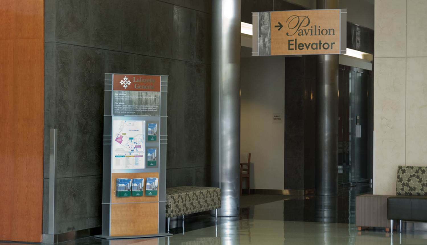
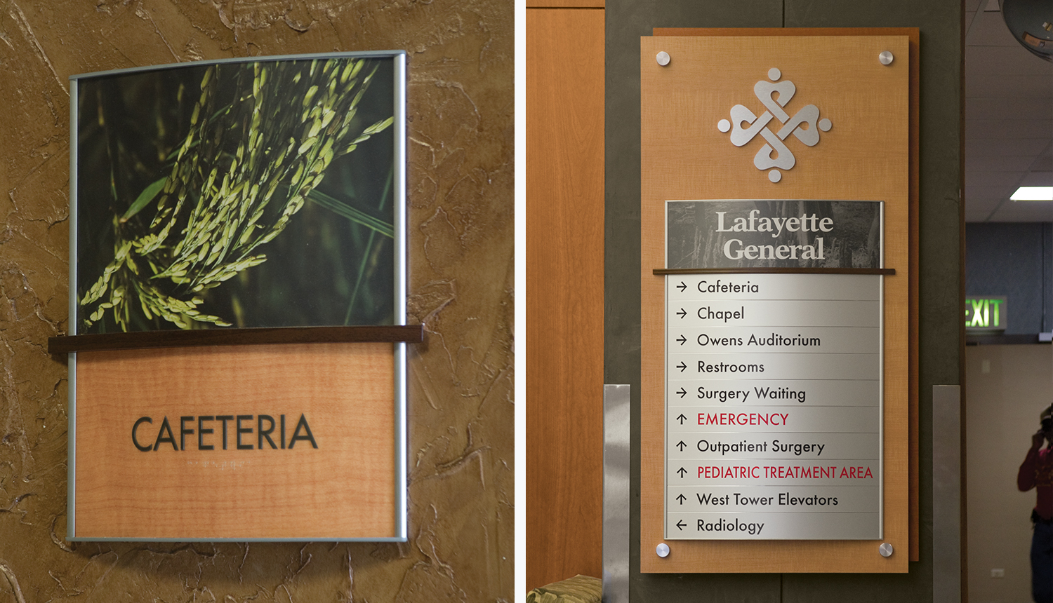
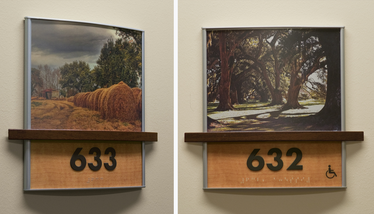
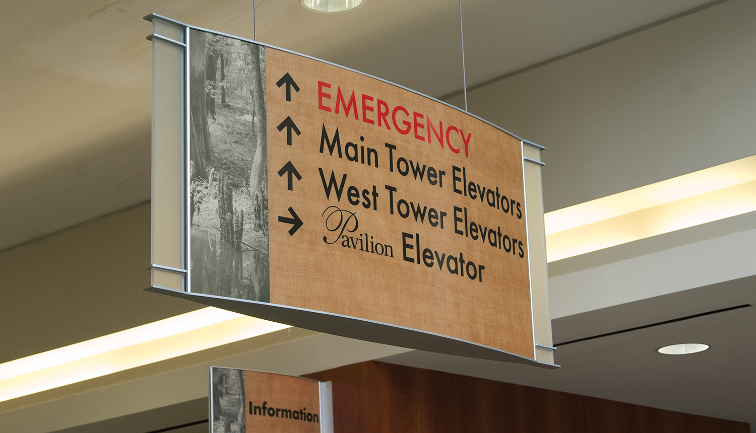
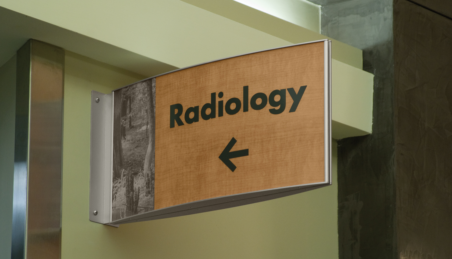
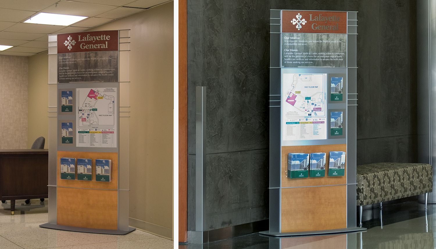
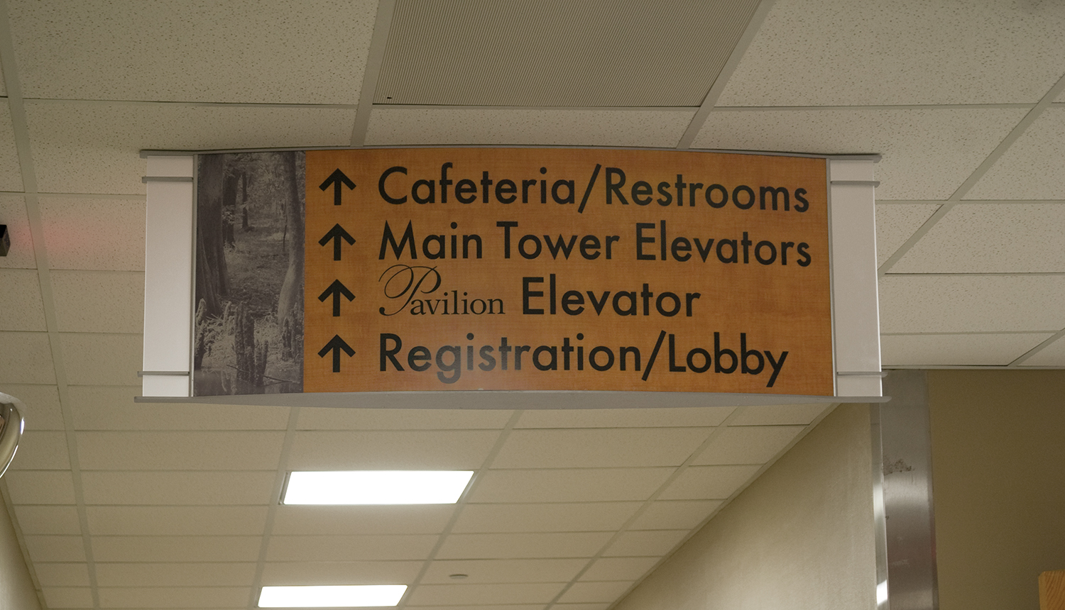
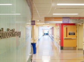
As part of the healing-focused renovation, the medical center needed to review and update its wayfinding plan, resulting in the need for a new interior signage program. After reviewing ASI’s work for Miami Valley Regional Hospital, which seamlessly integrates the hospital’s brand identity with the healing-focused interior design motif, the architect asked ASI submit a proposal. In partnership with the project architect, Washer Hill Lipscomb & Cabaniss, and the project designer, Marie Lukaszeski of Interior Design Solutions, ASI produced two signage prototypes that feature photo inserts of nature scenes. The first prototype matched the signage design specifications, but the second prototype utilized an extruded aluminum curve-faced frame with integrated frosted acrylic edge accent and a photographic-quality digitally-printed insert. The idea to bring an acrylic accent into the signage was drawn from the interior design theme of the main lobby entrance. After seeing the curve-faced prototype, the designer chose to go with the alternate design due to the acrylic accent and the ease of updating the inserts.
About the Solution
Once the alternate design decision was made, ASI began the design engineering work to integrate the frosted acrylic edges into the extruded aluminum frame for the suspended signage and monoliths. While the designer focused on creating the signage program and message schedule, ASI worked directly with the 20-person hospital renovation committee to create the new wayfinding plan. The final wayfinding plan reduced the number of signs and simplified the directional information. The revised wayfinding plan was driven by the three elevator banks and their ability to access certain floors of the hospital. As an example, only one elevator bank in the hospital can access the ICU area on the 2nd floor, which requires guiding visitors and staff down a specific path to arrive at the correct elevator bank for the ICU.
To help bring a healing-focused feeling to the interior design, ASI used photos from a local artist which feature nature scenes from the Acadiana region of southwest Louisiana. The complete solution has been adopted for the each floor of the medical center and the program will be implemented into the 2nd phase in the years to come.
CS1156

