Project: Children’s Hospital & Medical Center
Location: Omaha, NE
Markets Served: Healthcare
Design-Build Signage Solution Promotes Brand Identity for Midwestern Children’s Hospital
Children’s Hospital & Medical of Omaha is based on the commitment that no child in need of medical care would be turned away due to an inability to pay. Today, families from across the midwest region and beyond seek the experience and expertise of Children’s Hospital & Medical Center, and the hospital staff responds by providing care to more than 250,000 children each year. In 2008, Children’s Hospital & Medical Center embarked on a brand change throughout its network of physician medical offices and the central hospital. ASI was selected to be the long-term turn-key solution partner to implement the change for all of the locations. In addition, in 2010, Children’s expanded its main campus by adding a new five-story Children’s Specialty Pediatric Center along with a three-story underground parking structure, which was designed by the architectural firm HDR, Inc.
About the Solution
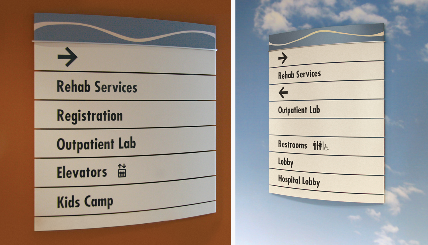
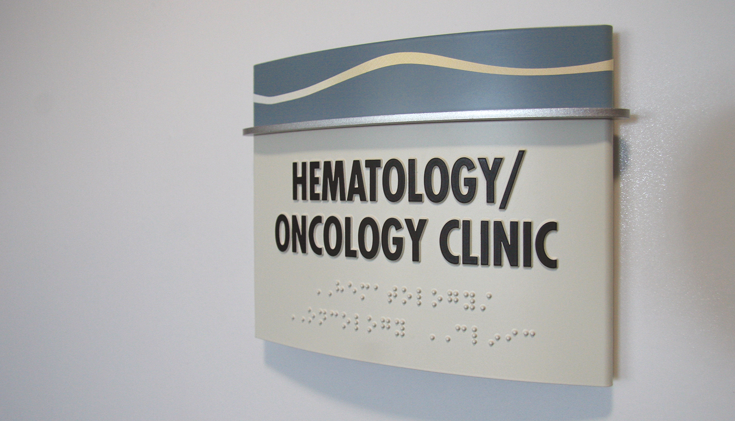
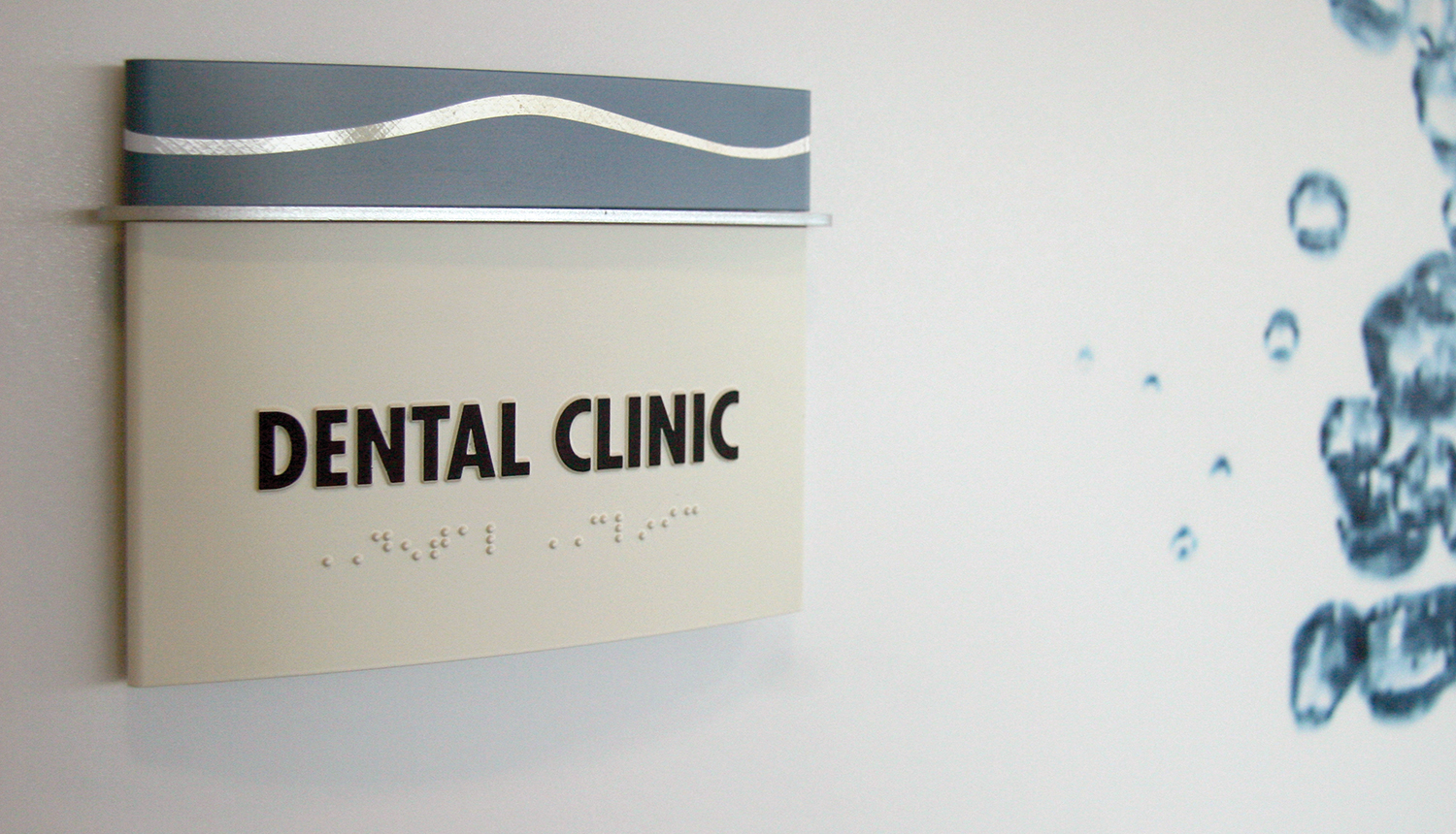
The most important aspect ASI took into consideration when designing the Children’s Hospital signage solution was the soft, curved architectural design of the exterior façade and the interior space. Throughout the existing hospital space, ASI had already used custom Pacific Interior™, a modular curved-face signage system. The shape and design complemented the new interior space and Pacific’s modular functionality allows for easy updates to graphic panels without replacing the entire sign. The interior design theme for the new pediatrics center includes ribbons of color that are implemented in the décor through colorful environmental graphics and colored materials and decorations. The ribbons are part of an intuitive wayfinding solution for patients and visitors to follow while navigating their way from department to department.
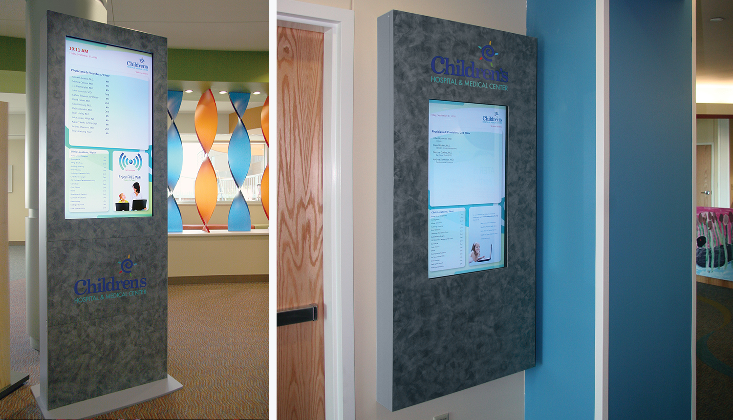
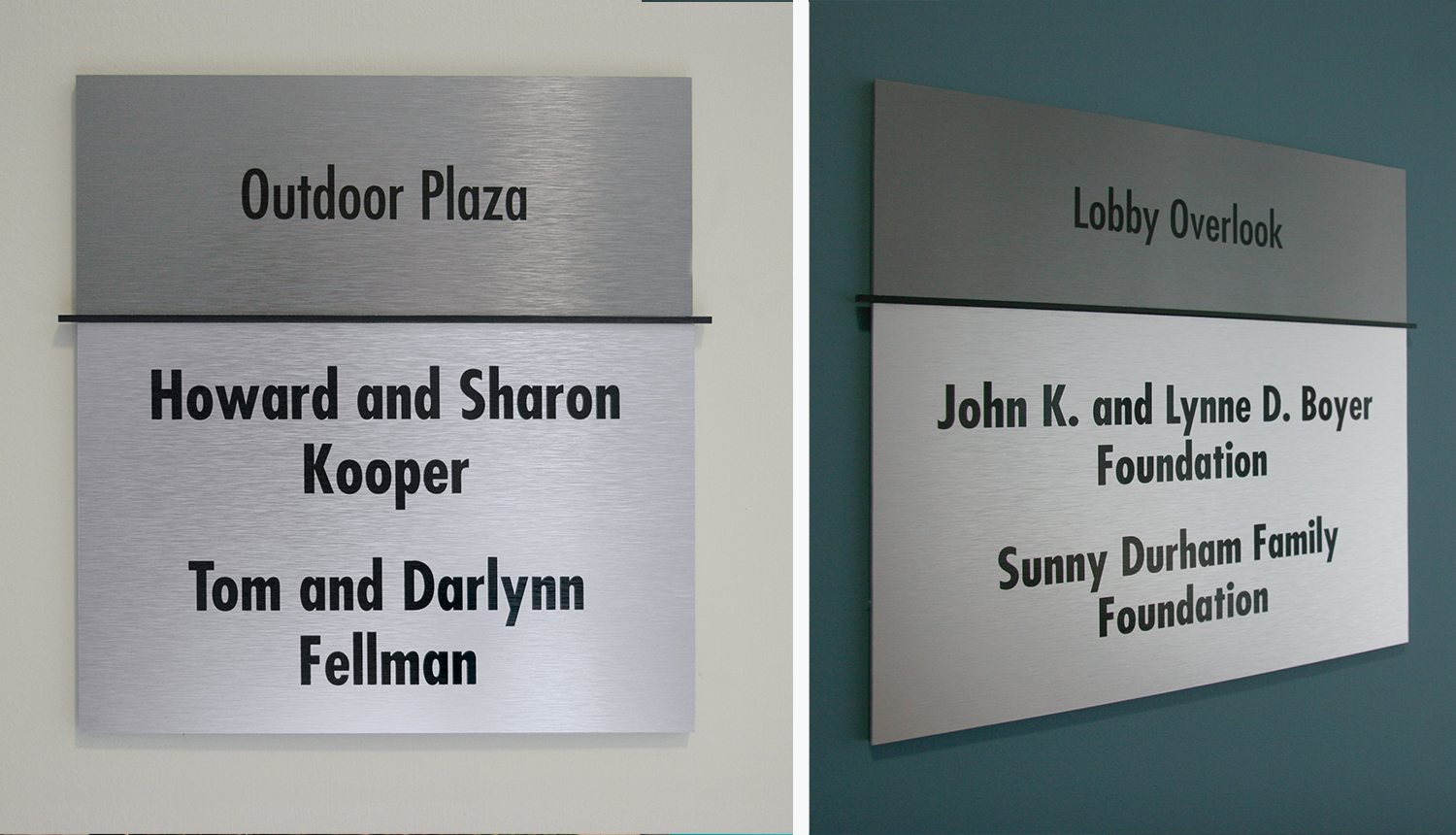
ASI integrated this ribbon design into the Pacific Interior™ solution by adding a dimensional accent bar and ribbon-like graphics to the header panel of select signs. As part of the interior solution, ASI provided donor recognition signage as well as dynamic digital signage directories. The digital signage is located at key wayfinding decision points, including elevators and the main entrance, to help patients and staff find their way.
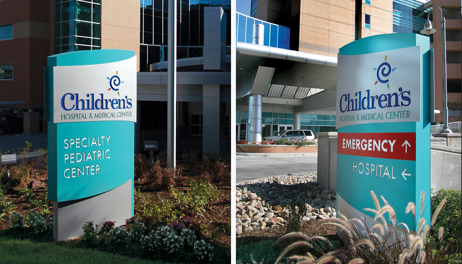
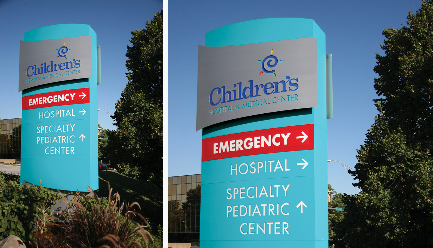
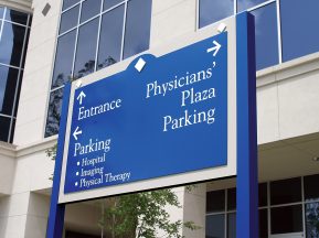
In addition to providing interior signage, ASI provided a comprehensive exterior signage and wayfinding solution for the hospital. Not only did the expansion and brand change require a new signage design solution, the new construction efforts created major challenges to the traffic flow and it transformed the landscaping and the layout of the master-planned campus. These changes meant that ASI would need to evaluate and update the wayfinding plan to ensure patients, visitors and staff entering the campus would be able to find their way to the right place at the right time as efficiently as possible.
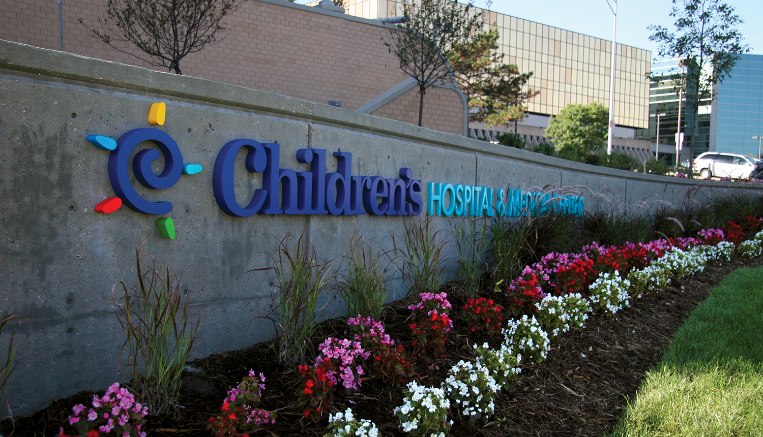
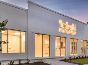
The finished custom exterior design solution integrates curves and soft, friendly colors as well as the hospital’s new brand identity into each sign. The custom exterior directional monoliths are internally illuminated to ensure the important wayfinding information can be visible day or night, and the curved panels and layering effectively complements the architectural design of the hospital. The custom dimensional logo on the top façade of the building acts a beacon to guide people to the facility from miles away while the ground level dimensional logo at the main entrance welcomes anxious parents and children into the hospital entrance. The complete solution successfully merges brand identity, wayfinding and architectural features which allows the medical staff to focus on care giving and leave the requests for directions behind.
CS1165

