Project: Ioannis A Lougaris VA Medical Center
Location: Reno, NV
Markets Served: Healthcare, Government
Healthier Wayfinding and Communication in Veterans of America Facility
The VA facility in Reno, Ioannis A. Louganis VA Medical Center, is an 800,000 sq. foot facility with approximately 150 beds. Every year the facility provides care to over 29,000 unique patients, which accounted for approximately 380,000 outpatient visits, while treating more than 4,000 inpatients. The existing room ID and wayfinding signage system has been in use for over 50 years with periodic updates.
The VA has a specific set of signage guidelines that must be adhered to including sign types, sizes, colors, fonts and layouts for every sign. In addition to these guidelines, the designer added custom attributes and accents which created a unique look as well as offering the ease of changeability. The existing signage program was inconsistent and included a plethora of different sign types resulting in outdated messaging that created a confusing labyrinth of information.
About the Solution
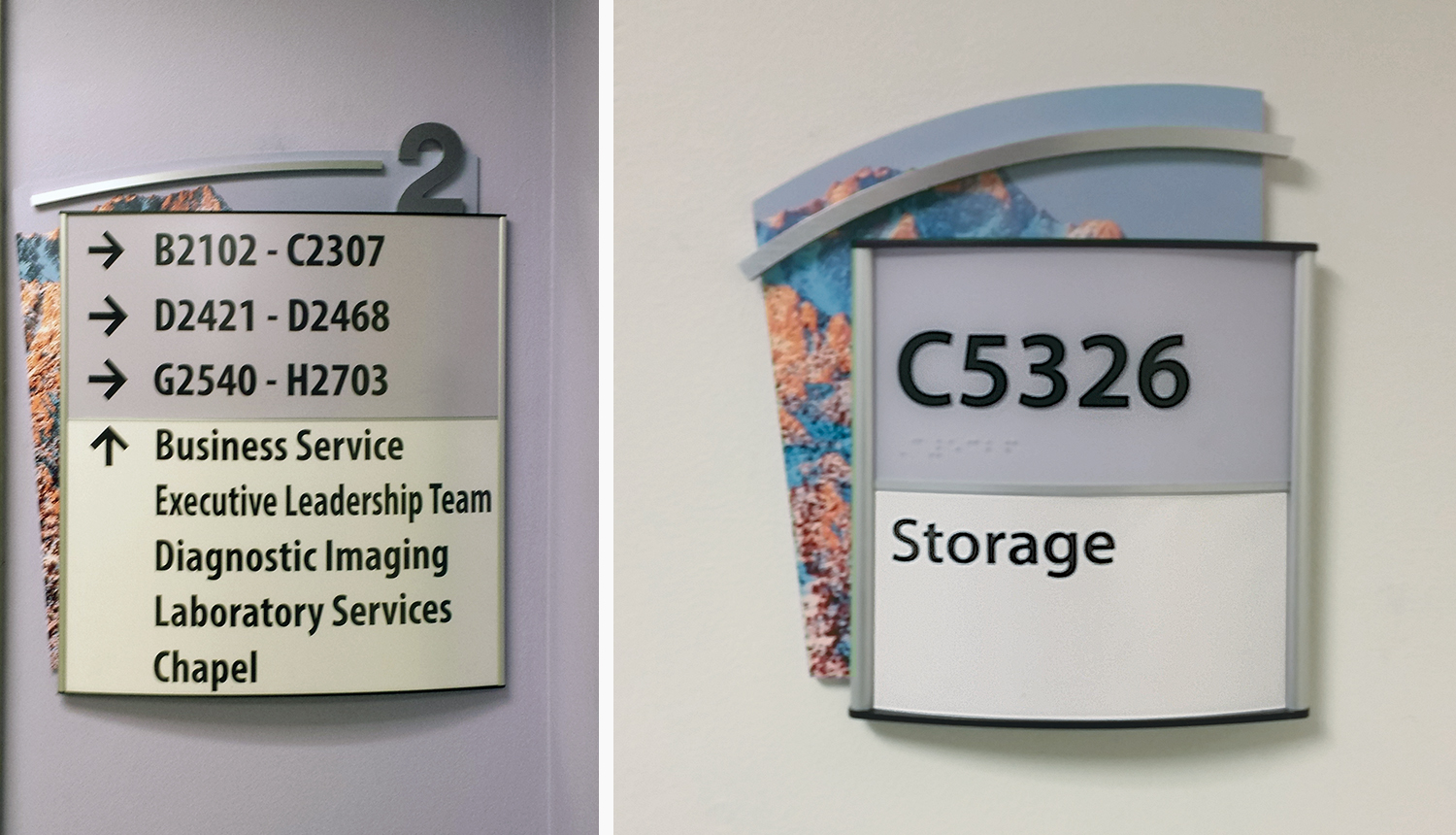
Horizon, interior signage system, was chosen due to its similar characteristics shown in the VA Guidelines. The ability to change out inserts was crucial in allowing onsite personnel to make changes on their own without having to contact outside vendors. The existing sign system was inconsistent in material and color. The Horizon signage created a “system” that promoted consistency and modularity. This modularity was needed in the ever changing environment this hospital experiences on a daily basis.
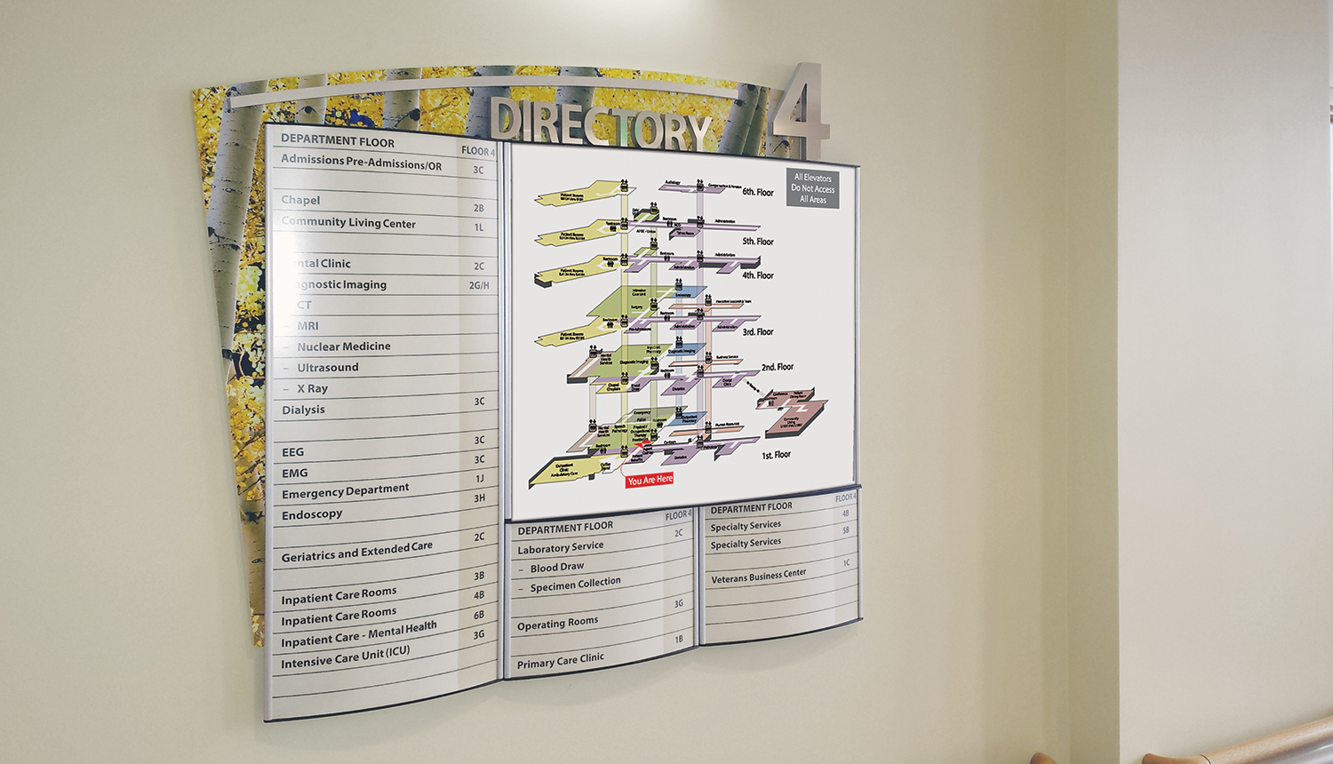
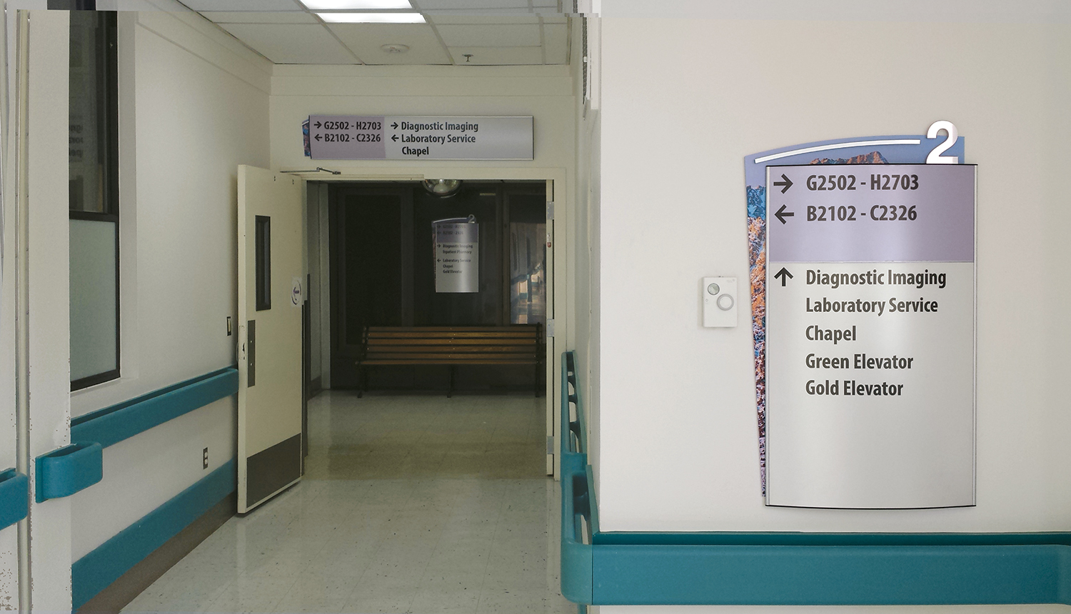
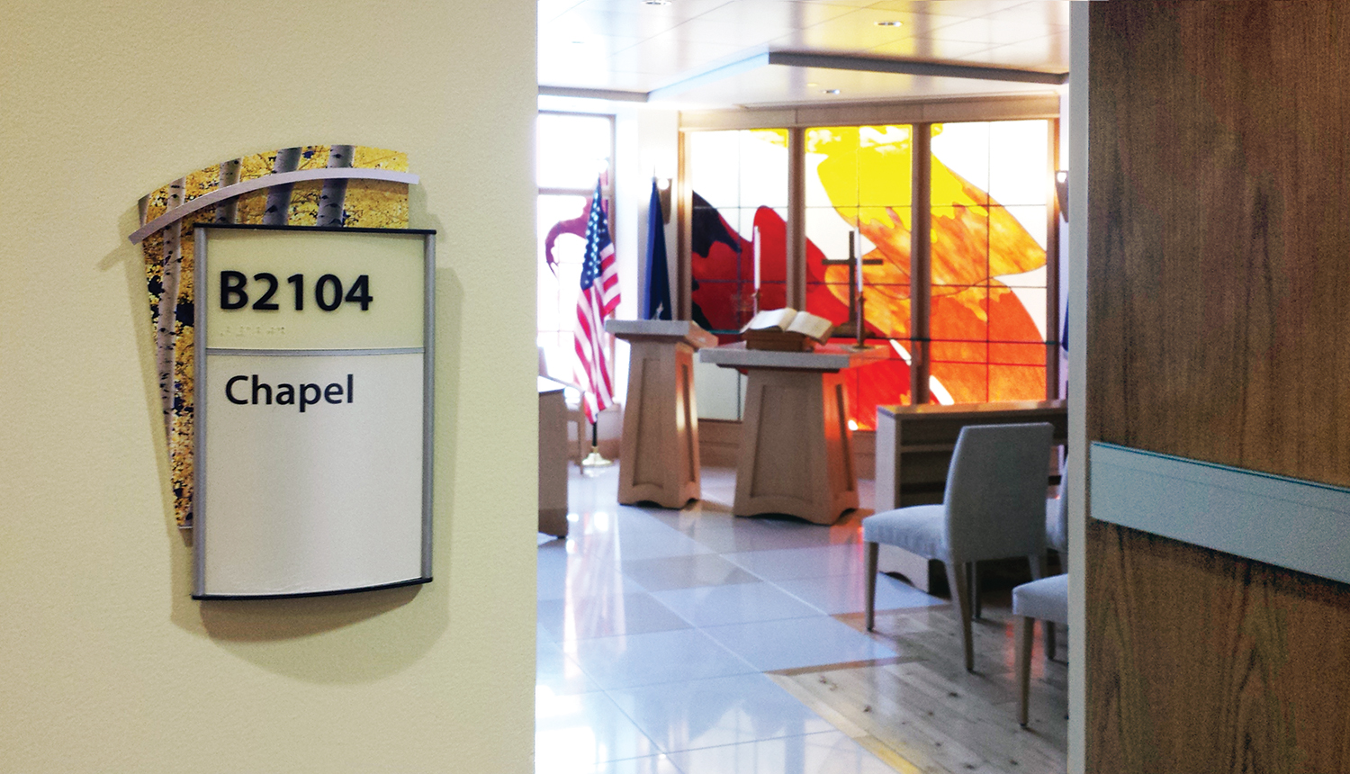
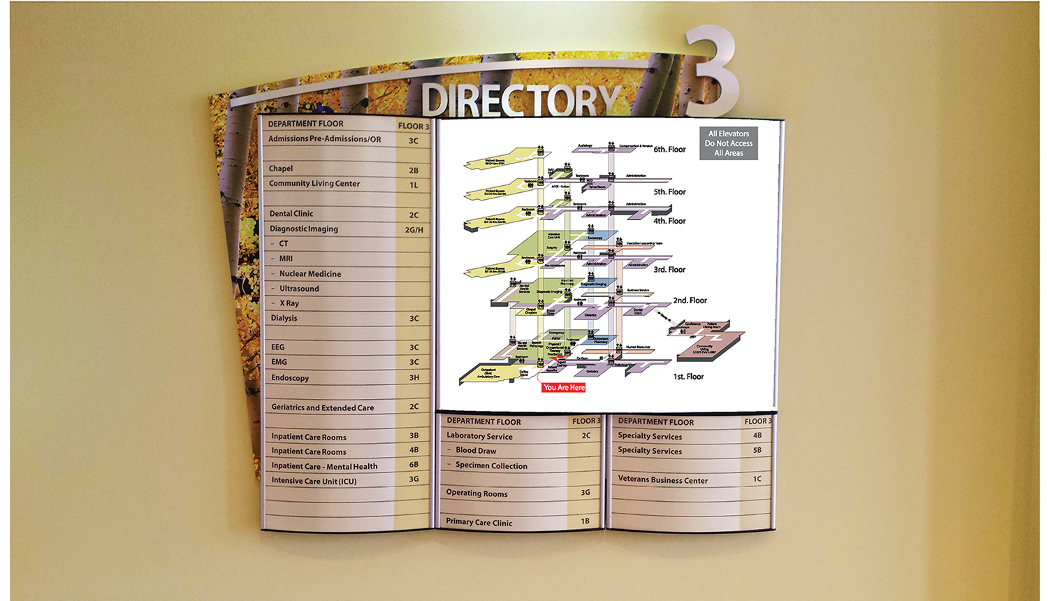
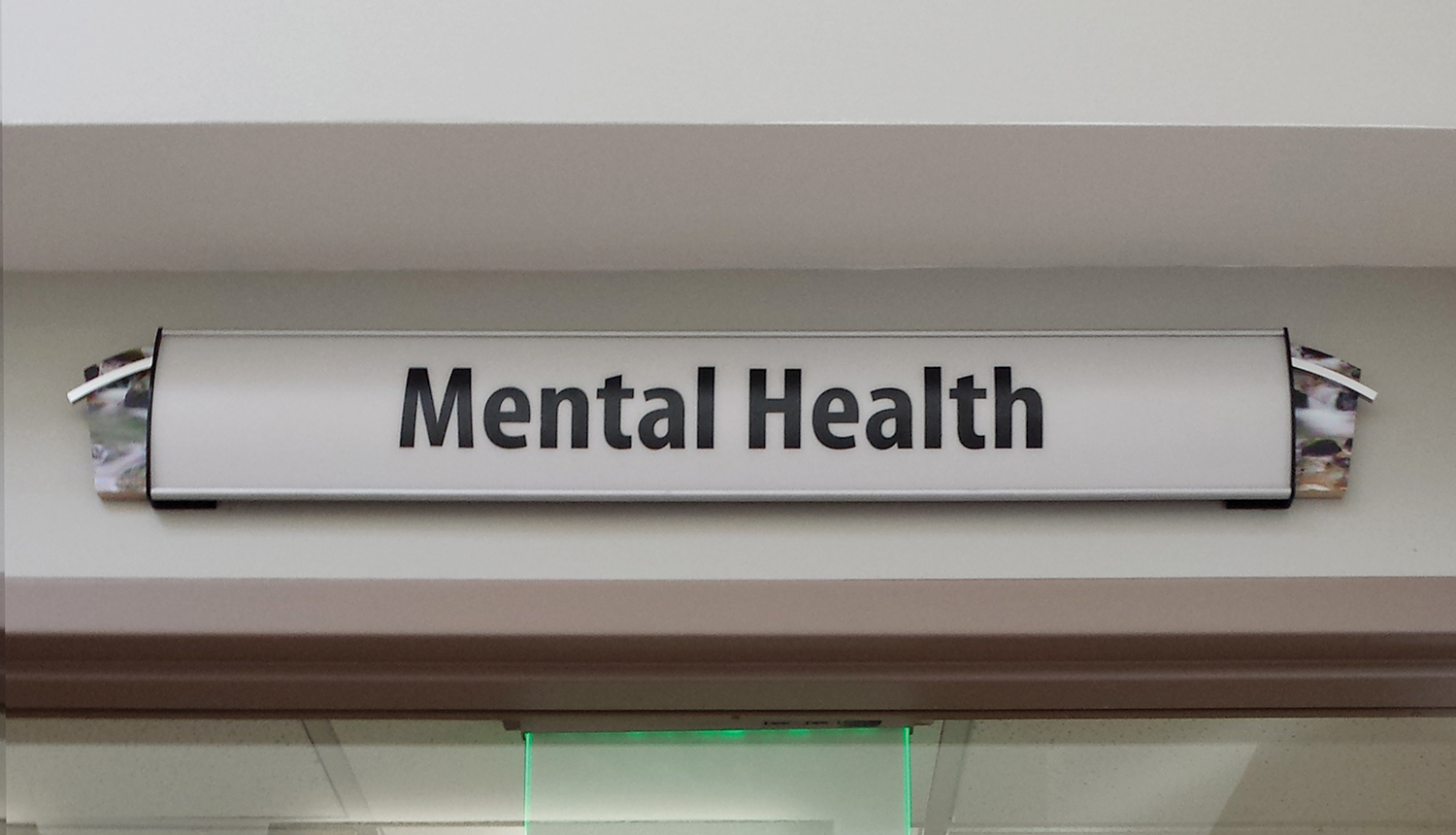
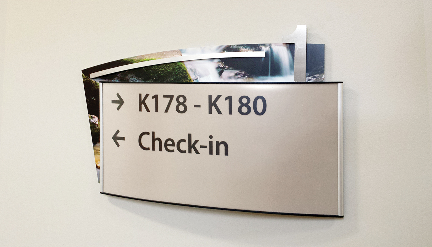
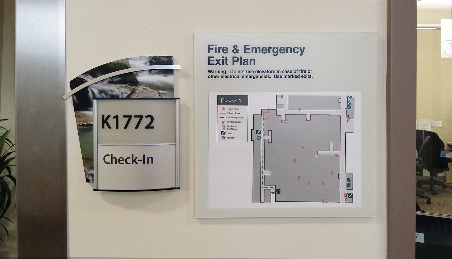
The solution consisted of the curved-face Horizon interior signage system complimented with a custom backer and high-resolution digital landscape photos and a brushed aluminum accent bar. ASI provided fabrication and installation services for over 3,000 interior signs consisting of room IDs, directories, as well as suspended and wall mounted directionals. The printed graphic and color on each sign denotes specific departments, areas, and floors within the hospital and aided in visitors through the facility.
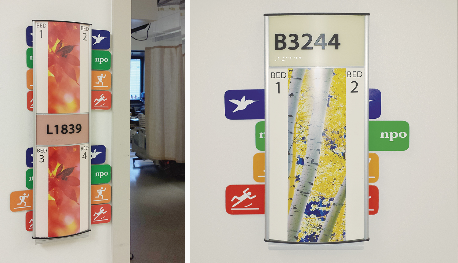
Patient room sign tabs were designed to show “Patient Protection” information. Easily identifiable colors and icons were developed to show the special need or circumstance of the room patient. In addition the tabs, which can be slid in-and-out, each contain a small clear rubber button for ease of use.
CS1249

